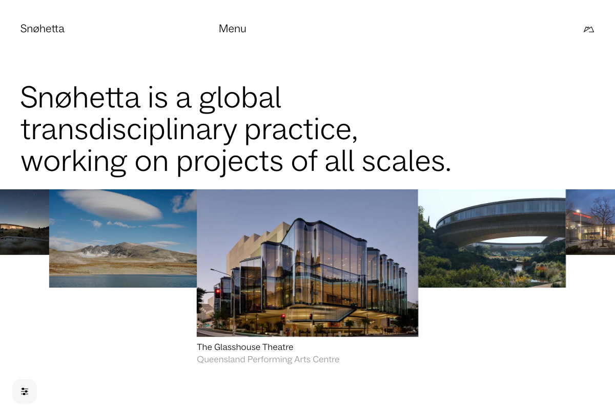
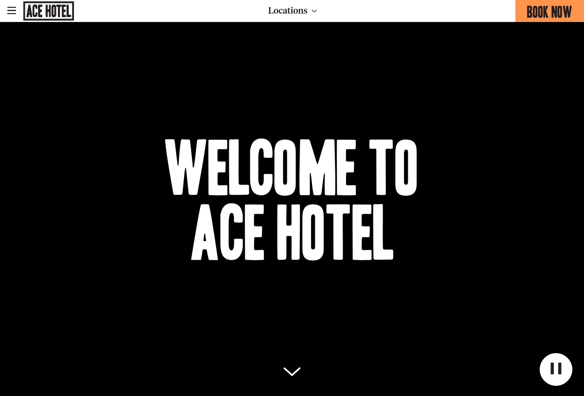
当前风格 / Current Style
建筑空间极简 (Architecture Space Minimal)
更像建筑事务所、空间设计与文化空间站点,靠留白、空间图像和项目秩序建立判断,不靠重组件。
适合做:建筑事务所 · 空间品牌 · practice archive
查看这个风格 / Open this styleDESIGN ATLAS — AI 建站风格参考库
选风格 → 拿 Prompt → 直接建站
17 种历史流派 · 36 种网页风格 · 每种风格配 AI Prompt
先看真实页面长什么样,再决定适合你的方向;不需要先懂设计史,也不用先会写风格提示词。
直接浏览风格 / Browse styles · 查看项目说明 / About · 看完整流派时间轴 / Open timeline
风格预览 / Style Preview
先扫一眼这些方向,再往下筛。
页面感觉坐标场 / Style Coordinate Field
先大致看这张图谱。桌面端把鼠标停在任一点上,下面会立刻换成对应风格的预览图、名字和适用场景。
当前风格 / Current Style
更像建筑事务所、空间设计与文化空间站点,靠留白、空间图像和项目秩序建立判断,不靠重组件。
适合做:建筑事务所 · 空间品牌 · practice archive
查看这个风格 / Open this style浏览风格 / Browse
首页先看一组代表性风格,完整数量、搜索和筛选都放到 Browse 页面。当前 atlas 已经扩到更完整的网页风格谱系,不再停留在最初那 23 个方向。
查看全部 36 种风格 / View all 36 styles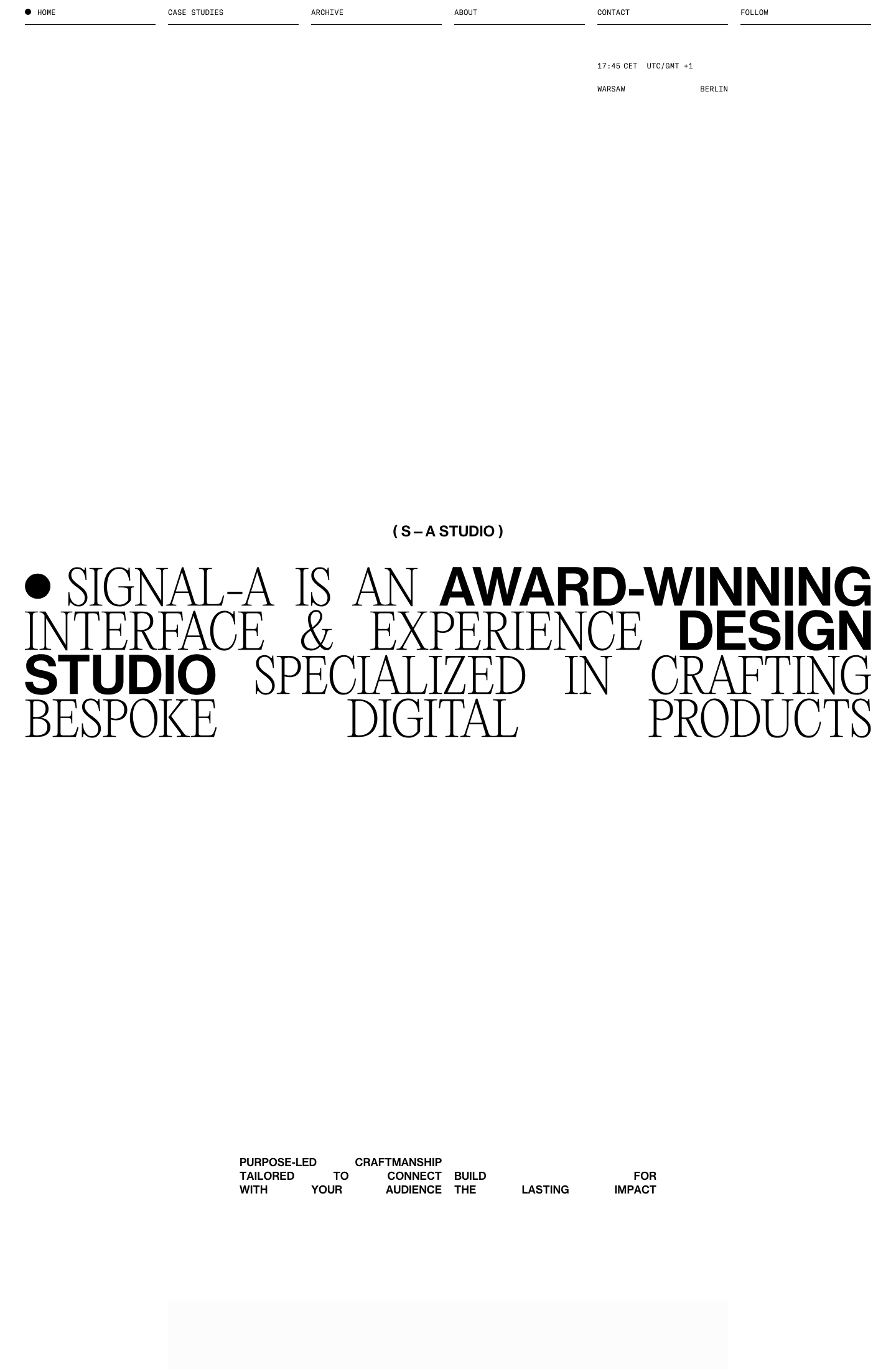
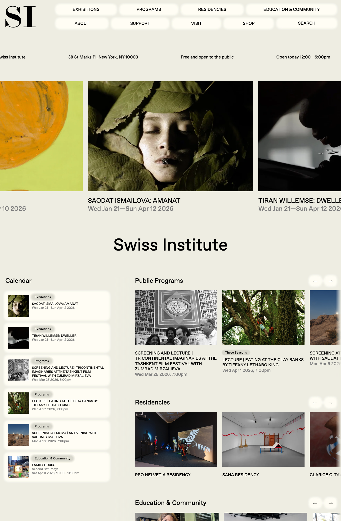
主参考:Signal-A Studio
适合做:档案站 · 工作室 · 参考库
对应 Skill:12 列或明确模数网格 · 一个无衬线主字体
主参考:Fictive Kin
适合做:作品集 · 品牌站 · 工作室
对应 Skill:项目索引是主角 · 黑白对比要靠字重和字号拉开
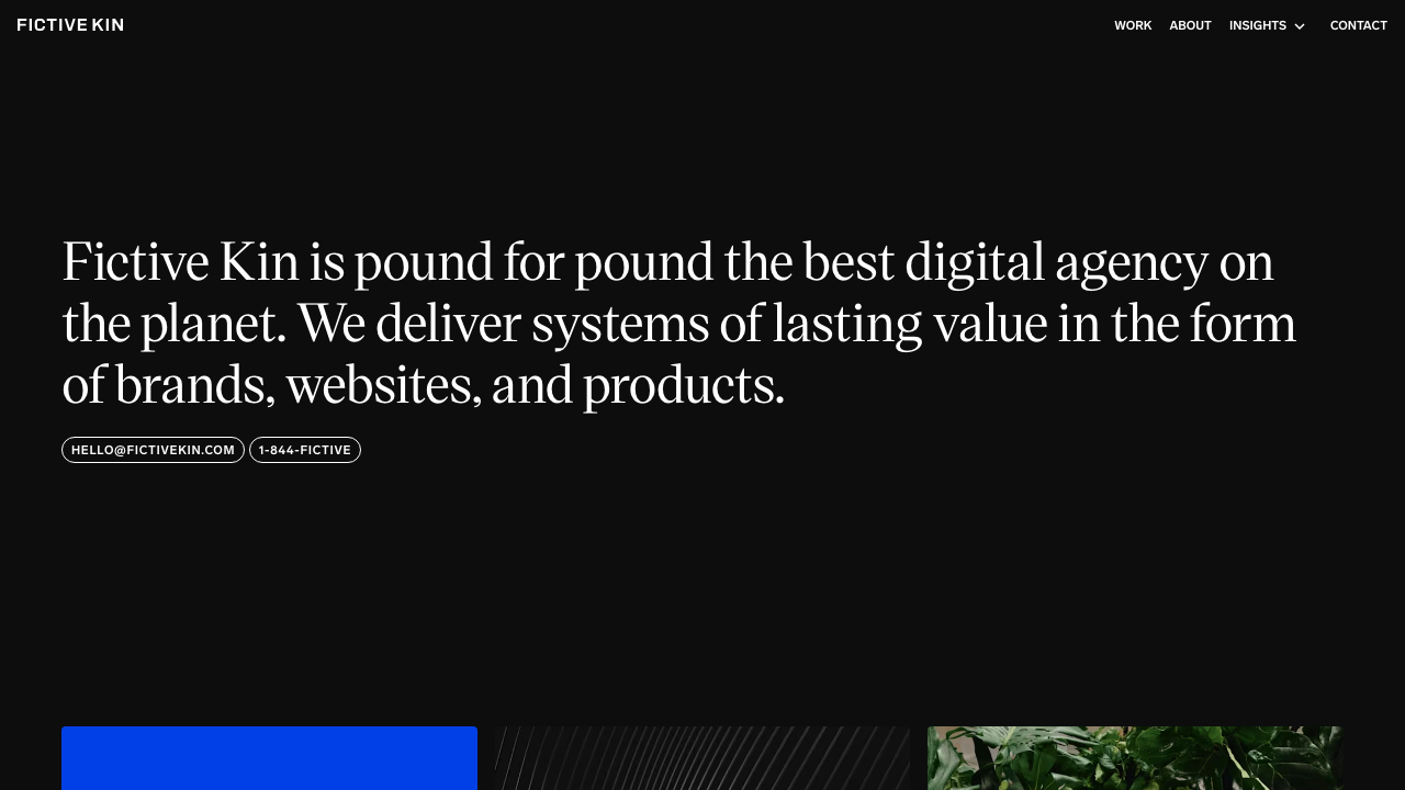
主参考:Studio Feixen
适合做:工作室作品集 · 案例展示 · Selected Works
对应 Skill:先作品网格再解释 · 标题退后一步
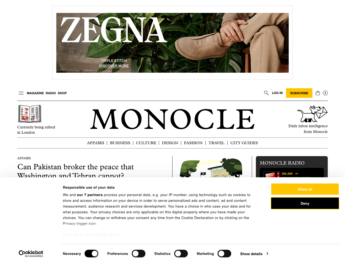
主参考:Monocle
适合做:生活方式品牌 · 现代产品品牌 · 内容品牌首页
对应 Skill:现代目录和品牌叙事并存 · 字要清楚但不生硬
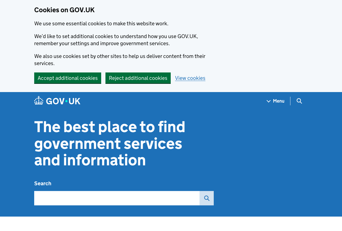
主参考:GOV.UK
适合做:公共服务站 · 流程办理页 · 服务设计文档
对应 Skill:先任务,再解释,再扩展 · plain language 比个性更重要
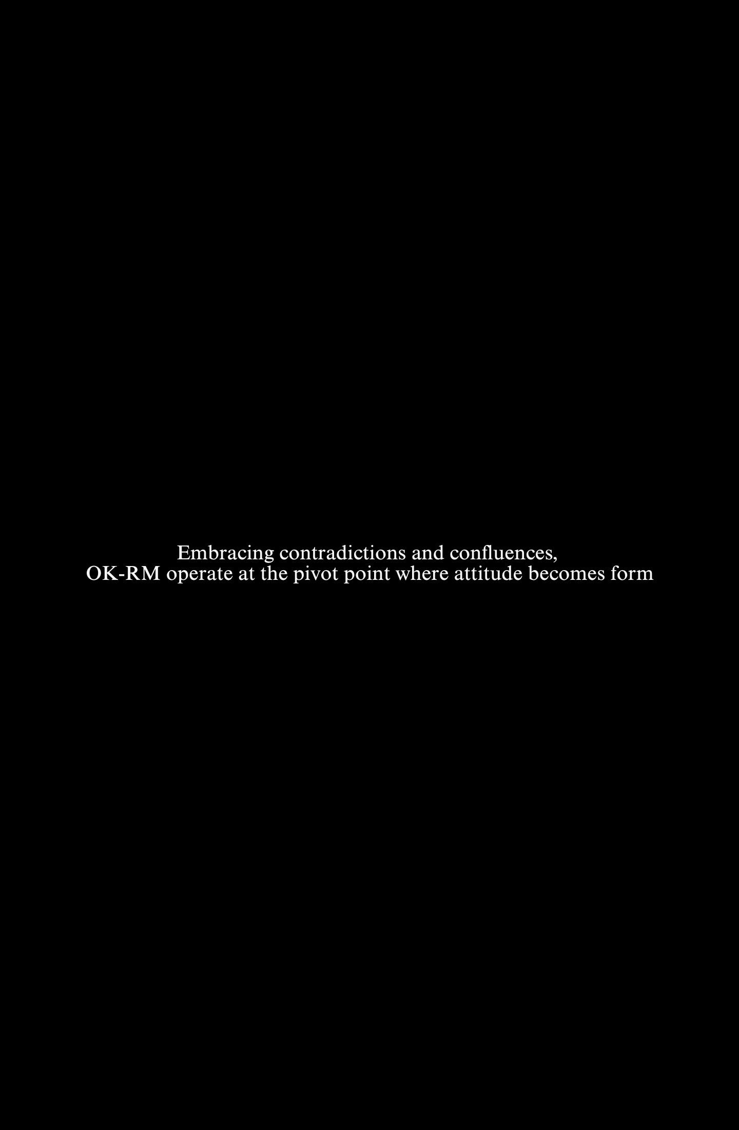
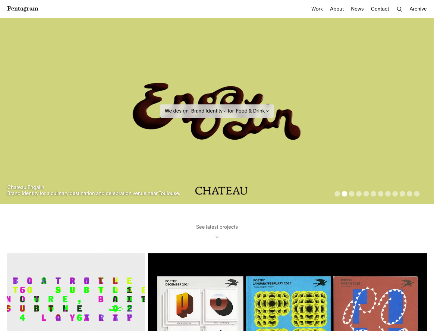
主参考:OK-RM
适合做:建筑事务所 · 空间品牌 · practice archive
对应 Skill:让空间图像占主导 · 标题和项目名要像 practice archive
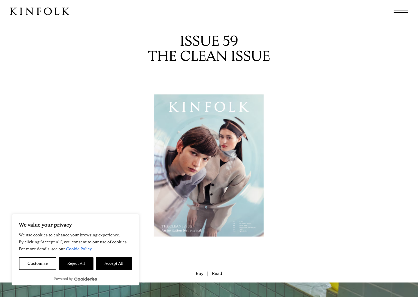
主参考:Kinfolk
适合做:酒店品牌 · 餐饮空间 · 城市场景页
对应 Skill:首屏先让人进入场景 · 标题像地点或节目单而不是广告口号
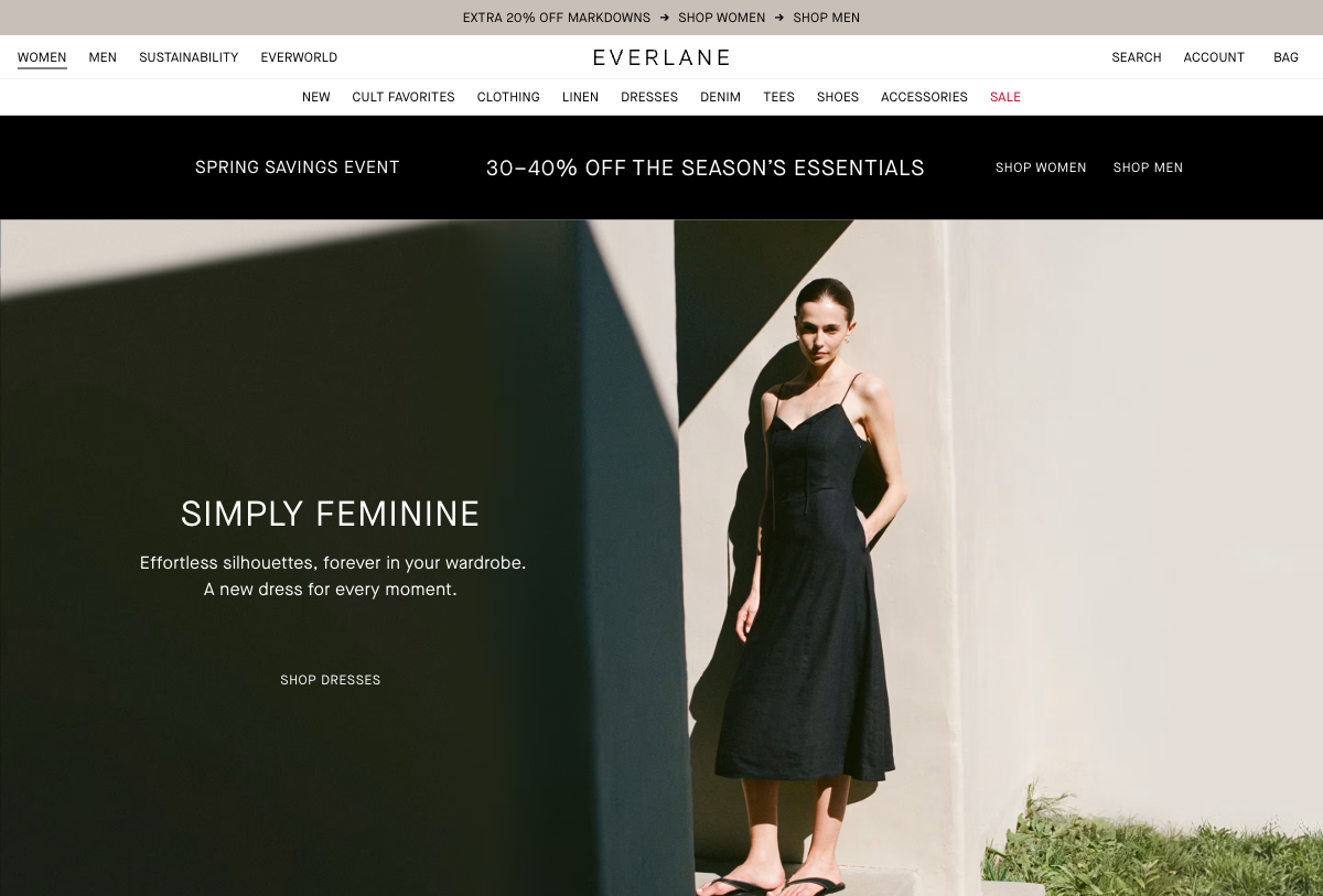
主参考:Everlane
适合做:服饰零售 · DTC 品牌 · 品类目录页
对应 Skill:让品类入口、精选单品和品牌语气并存 · 标题像品牌语气而不是促销 banner
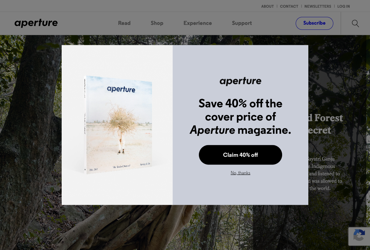
主参考:Aperture
适合做:摄影出版 · 图像档案 · 艺术期刊
对应 Skill:封面位和 issue archive 要共存 · 标题像 issue 名和 essay 标题
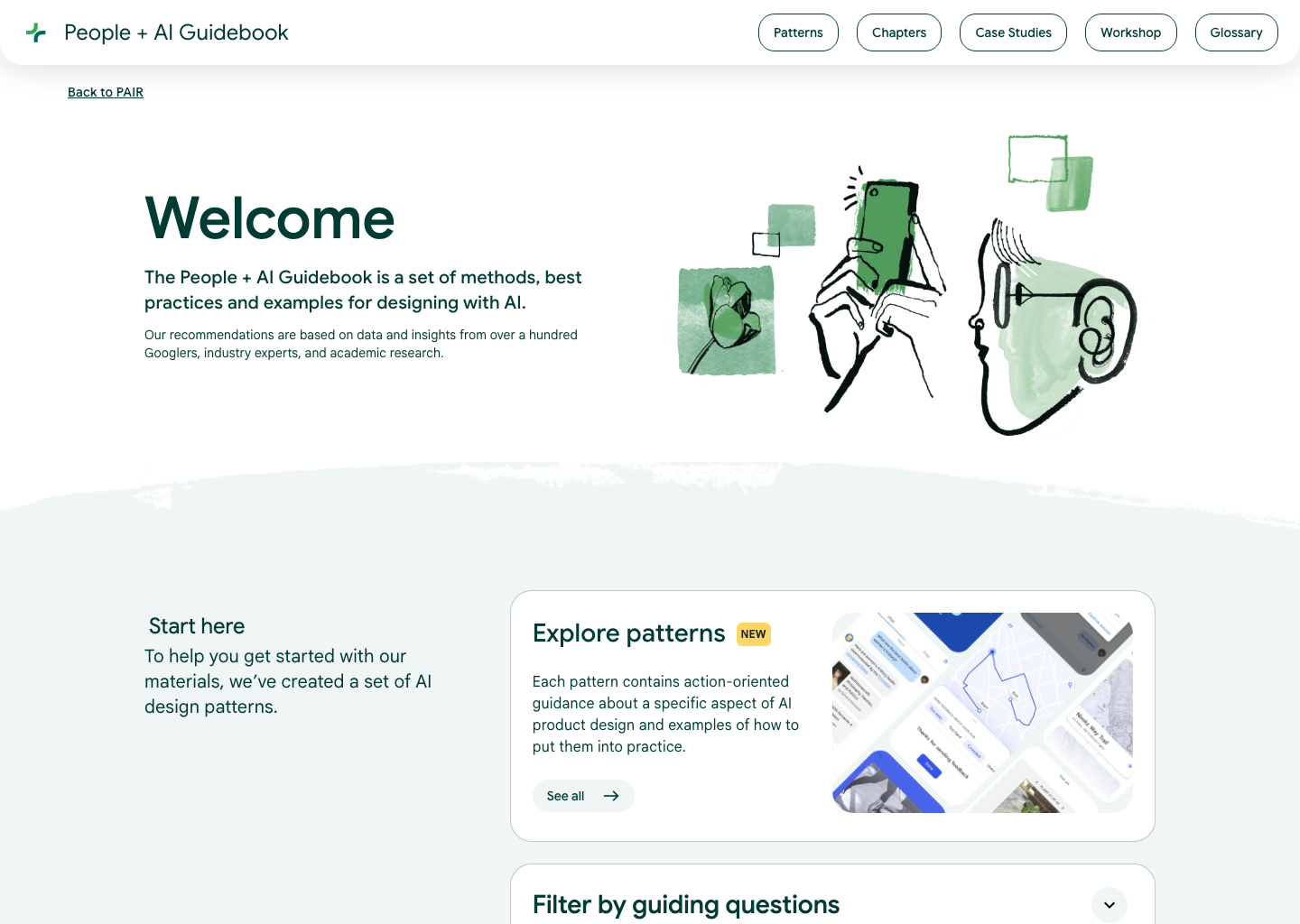
主参考:People + AI Guidebook
适合做:年度报告 · 研究专题 · 影响力报告
对应 Skill:先结论再证据 · 标题像章节而不是广告口号
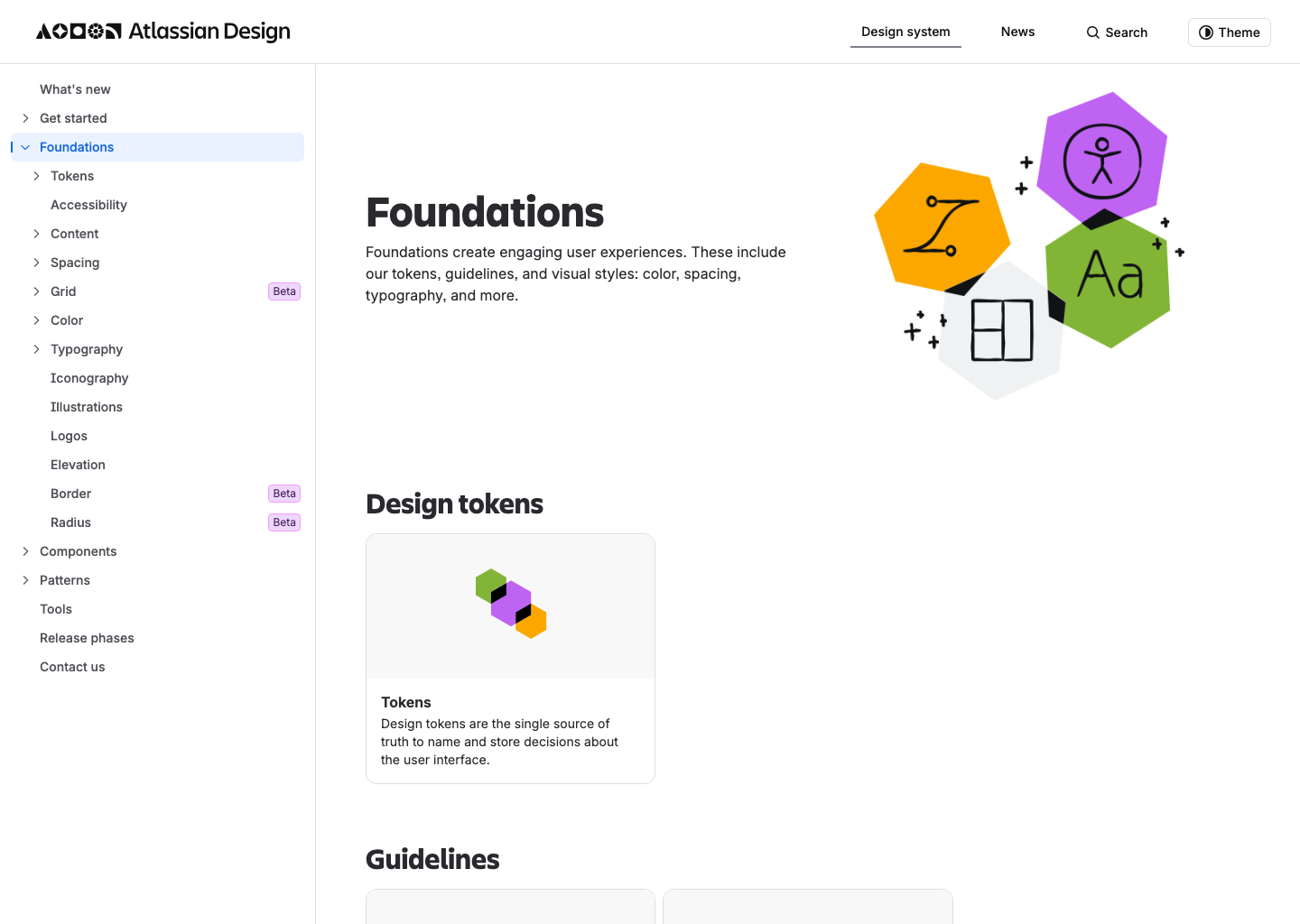
主参考:Atlassian Foundations
适合做:设计系统 · 组件规范 · 基础库
对应 Skill:foundation、component、pattern 要是一级入口 · 层级像文档系统而不是品牌广告
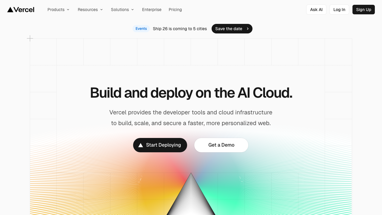
主参考:Vercel
适合做:云平台 · 开发者工具 · API 平台
对应 Skill:首屏先讲平台能力和可信度 · 无衬线为主
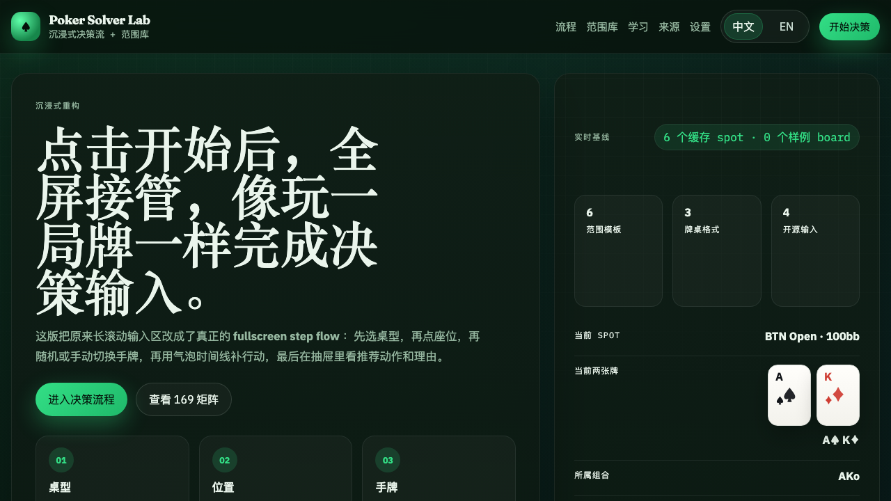
主参考:Poker Solver Lab
适合做:决策工具 · 训练产品 · 复杂选择流程
对应 Skill:先给一块沉浸式主舞台 · 标题要像操作指令一样直接
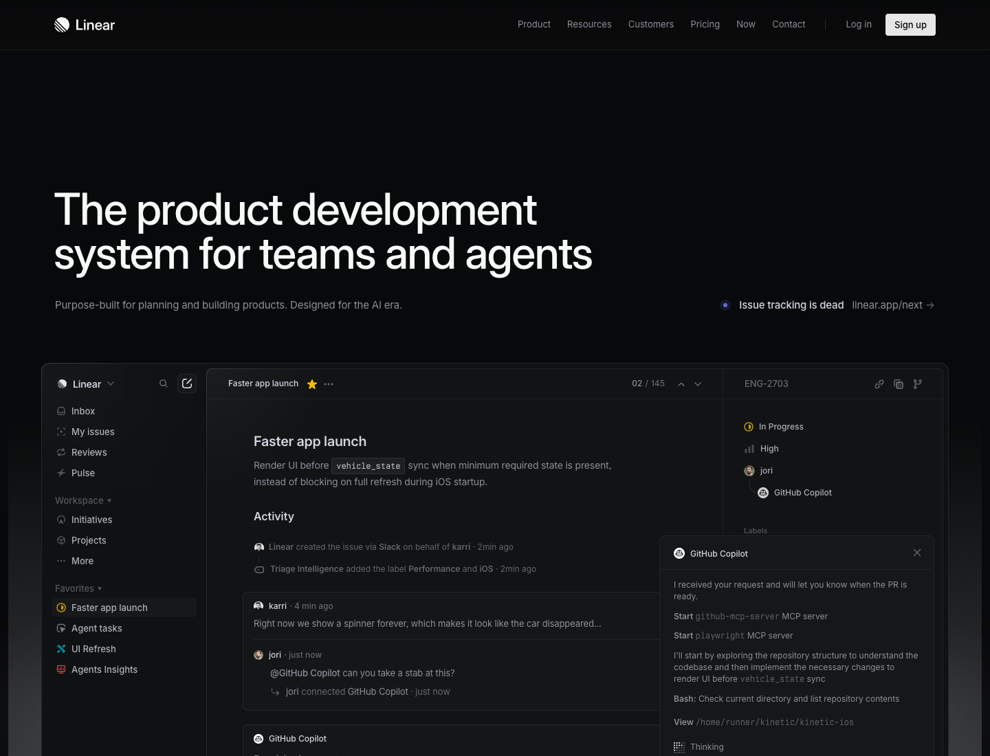
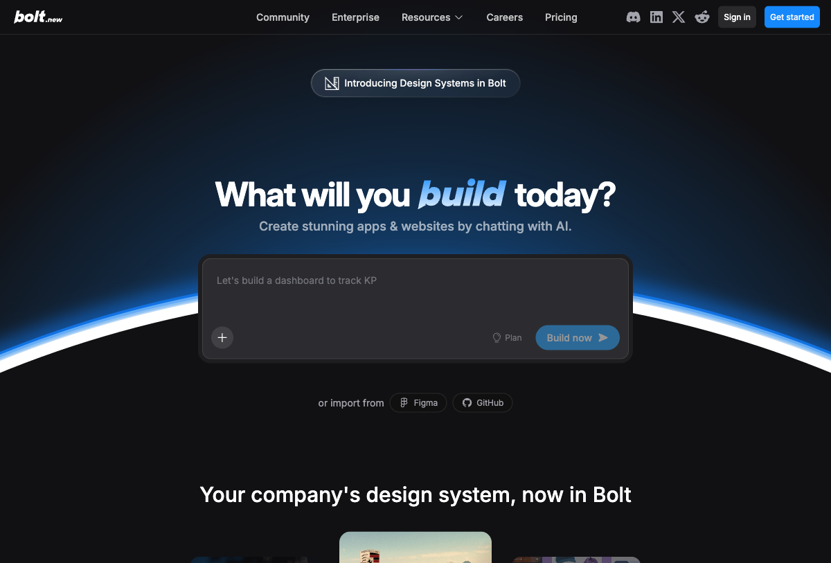
主参考:Linear
适合做:AI 产品 · startup 官网 · 模块化 landing page
对应 Skill:hero 之后立刻进入 bento 卡片 · 标题要直接说明能力
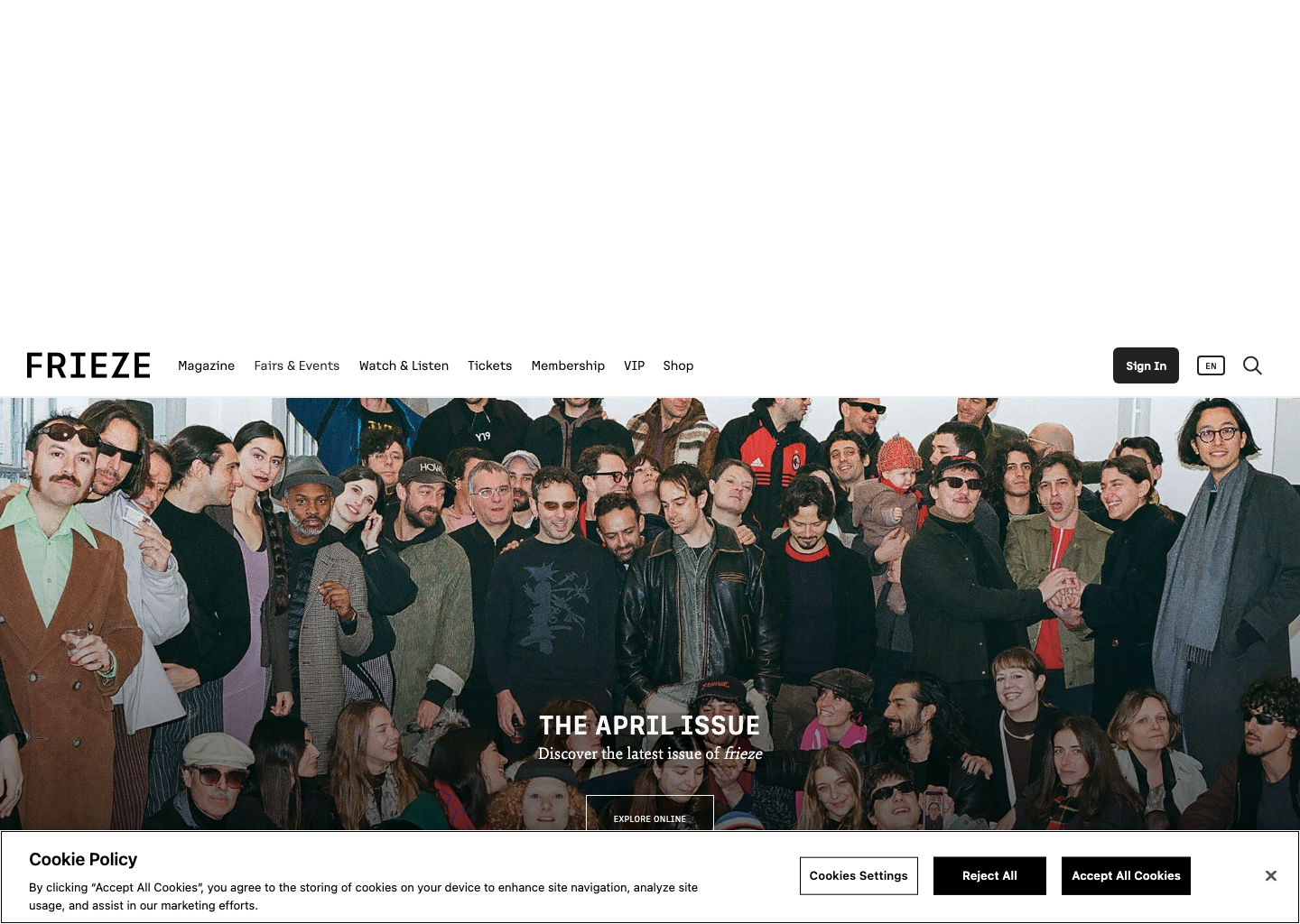
主参考:Frieze
适合做:创意媒体 · 设计博客 · 文化资讯
对应 Skill:先有 lead story 再有次级栏目 · 标题、栏目、时间和作者信息都要清楚
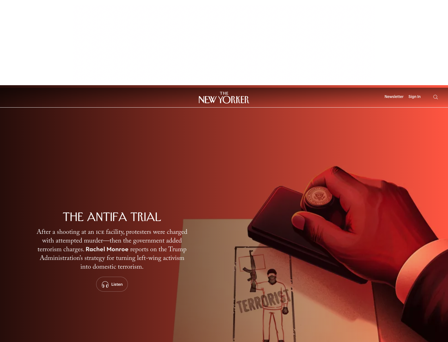
主参考:The New Yorker
适合做:评论媒体 · 文化周刊 · 长期刊物
对应 Skill:首页像持续更新的 front page · 刊头权威感很重要
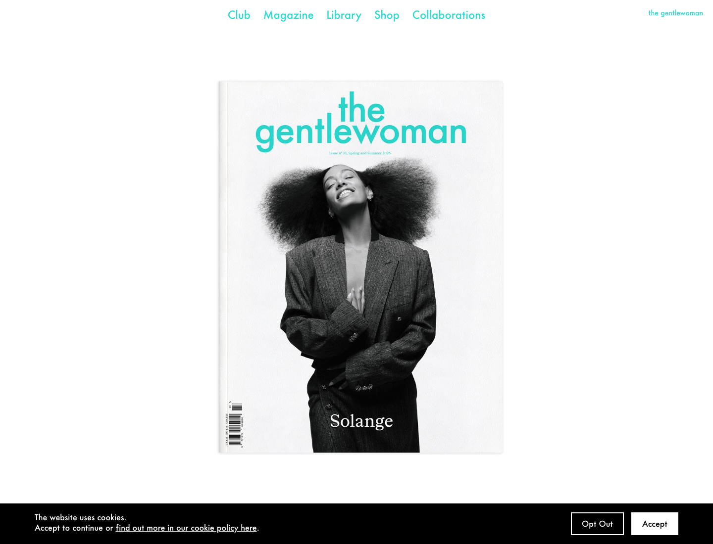
主参考:The Gentlewoman
适合做:时尚品牌 · 奢刊专题 · 文化品牌
对应 Skill:首屏像大片封面 · serif 与 sans 组合更明显
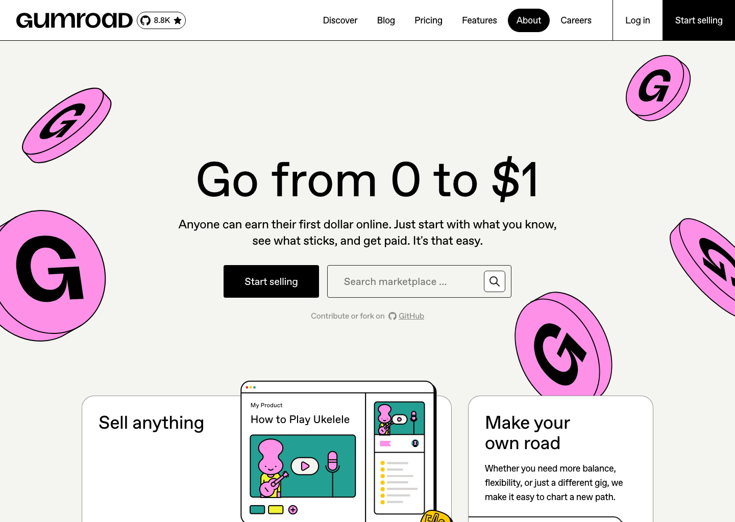
主参考:Gumroad
适合做:创作者发布 · 实验品牌 · 宣言页
对应 Skill:边框和块面要明确 · 标题更硬更直给
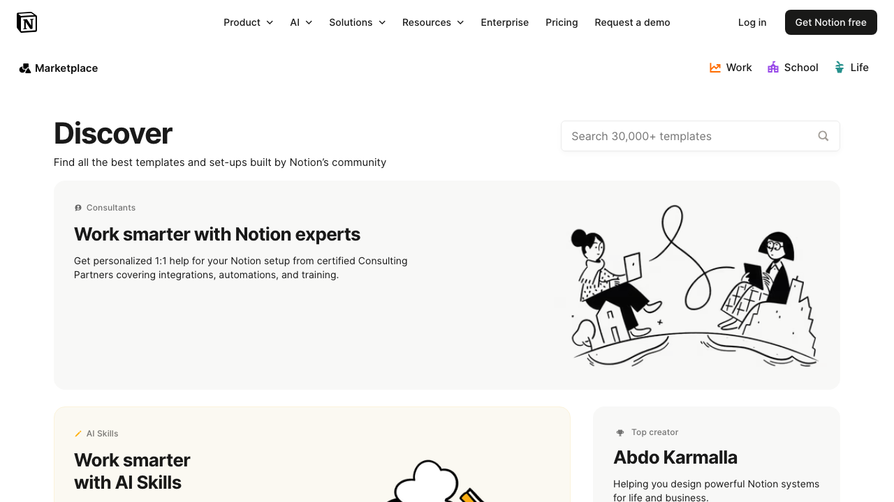
主参考:Notion Templates
适合做:模板库 · Prompt 库 · Starter Kit
对应 Skill:首页就是筛选和比较入口 · 标题短而准
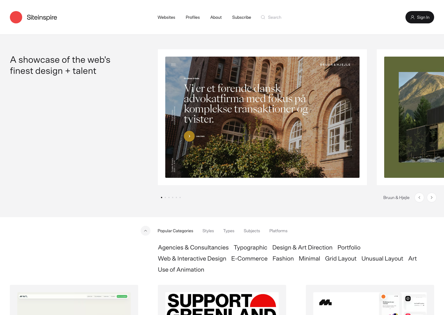
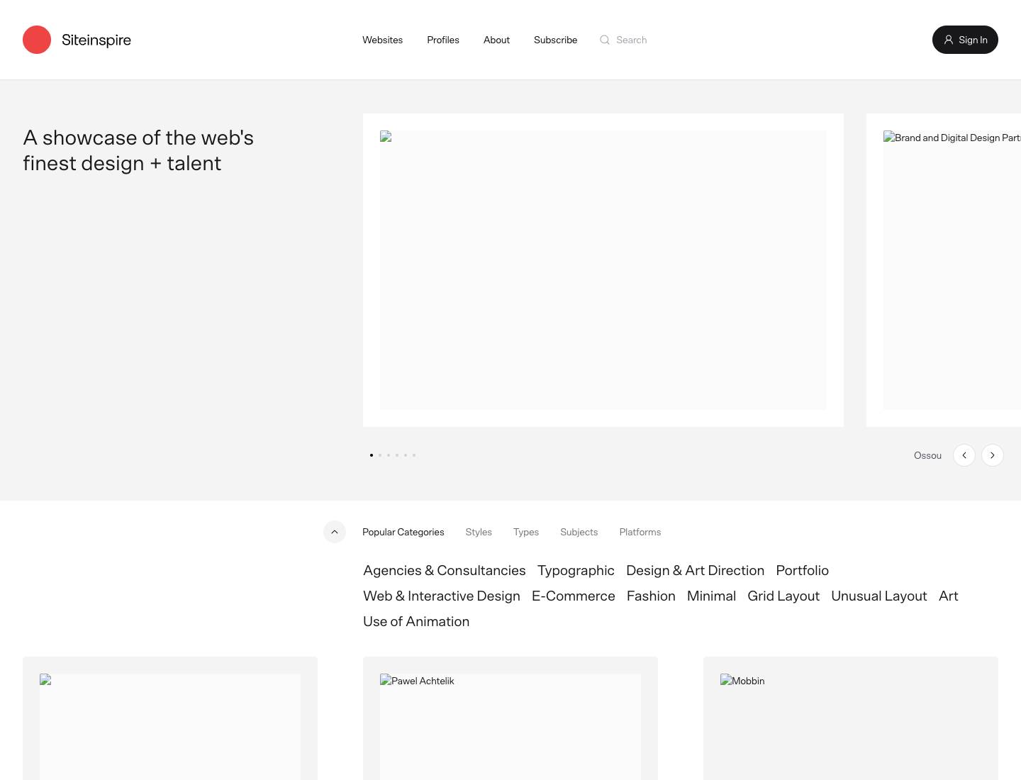
主参考:SiteInspire
适合做:甄选案例站 · 奖项展示 · 灵感发现
对应 Skill:先有 featured 或 curated picks 再有案例墙 · 分类 chips、精选标题和站点名要很好扫
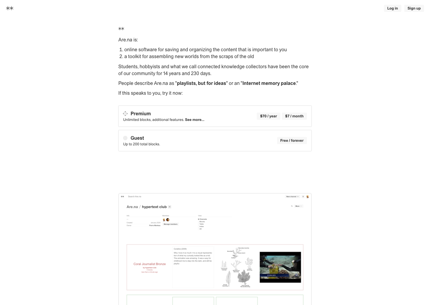
主参考:Are.na / Board
适合做:灵感库 · 研究地图 · 案例收集
对应 Skill:支持收藏、关联、回访 · 卡片标题和标签必须易扫
没有找到匹配的风格,换个筛选或关键词试试。 / No styles matched. Try another filter or search.